What Quiet Luxury Taught Us About Brand Positioning
Quiet luxury wasn’t just a trend.
It was a recalibration.
What Is Quiet Luxury?
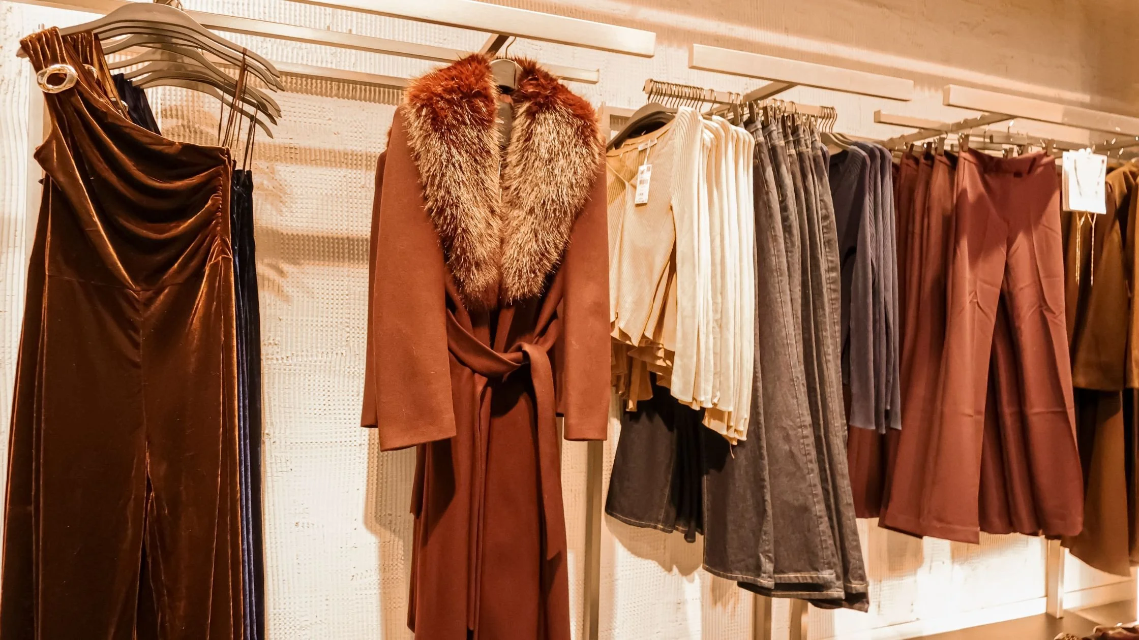
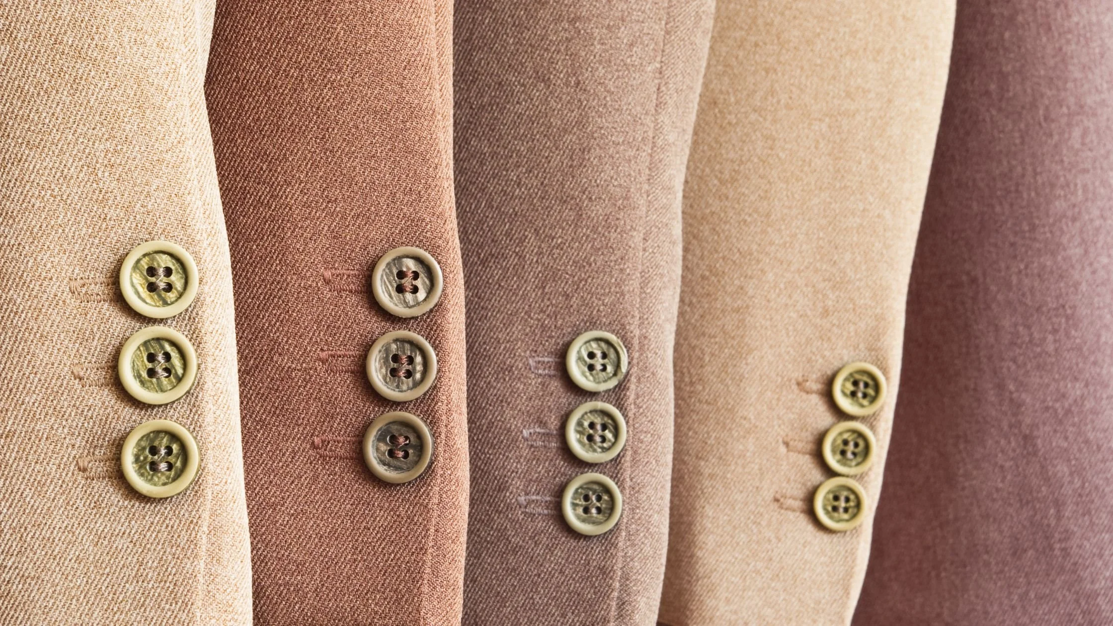
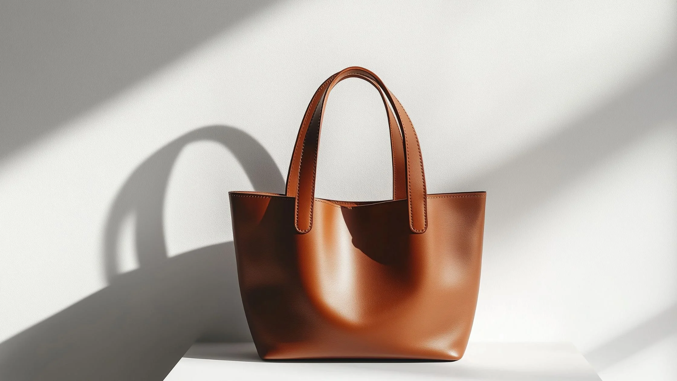
Quiet luxury refers to a fashion movement centred on understated design, muted colours, minimal visible branding, and an emphasis on fabric and construction quality. Instead of relying on bold logos or obvious status symbols, it signals value through tailoring, material choice, and subtle detail. It gained widespread attention during a period when many consumers began favouring longevity and discretion over overt branding.
But beneath the aesthetic shift, something more strategic was happening.
Quiet luxury wasn’t simply about looking expensive.
It was about looking certain.
At a time when logos had dominated visibility and digital culture rewarded loudness, restraint began to feel intelligent. Muted palettes, refined silhouettes, and measured branding weren’t just stylistic choices; they signalled confidence.
That kind of confidence in branding is what creates positioning.
The Difference Between Aesthetic and Brand Positioning

Many brands interpreted quiet luxury visually.
They removed logos.
Neutralised colour palettes.
Simplified typography.
Softened their imagery.
But aesthetic restraint is not the same as brand positioning.
Positioning answers:
Who is this for?
What problem does it solve?
What emotional space does it occupy?
Why does it exist now?
Quiet luxury resonated because it positioned itself as:
Discreet confidence.
Financial literacy.
Cultural awareness.
Long-term taste over short-term trend.
It wasn’t beige for the sake of beige.
It was restraint as identity.
Cultural Context Matters More Than Colour in Fashion
Quiet luxury gained momentum in a post-pandemic, economically uncertain climate.
Consumers were recalibrating their relationship with spending, status, and visibility.
Loud logos began to feel performative.
Subtlety felt intelligent.
Brands like The Row and Loro Piana didn’t suddenly change; the cultural appetite shifted toward what they already embodied.
This is the strategic lesson.
Strong positioning doesn’t chase trends.
It becomes relevant when the context aligns.
The Evolution of Quiet Luxury
Quiet luxury didn’t emerge in isolation. It followed a decade shaped by visible branding, influencer-led status signals, and rapid digital amplification. As economic uncertainty increased and consumer priorities shifted, overt displays of wealth began to feel less aspirational and more exposed. Subtlety — once perceived as niche — became culturally resonant. Brands that had long embodied discretion suddenly appeared contemporary. What changed wasn’t their identity. It was the environment around them.
The Illusion of Copying the Surface of Quiet Luxury

When a positioning moment becomes visible, it invites imitation.
Suddenly, countless brands:
Muted their colour palettes.
Adopted serif typography.
Shifted toward minimal websites.
Used language like “timeless,” “elevated,” and “considered.”
But without underlying clarity, those changes are cosmetic.
If a brand’s core identity isn’t built around restraint, craftsmanship, or long-term investment value, quiet luxury becomes costume.
And customers can sense that.
Trends expose positioning weaknesses.
They don’t fix them.
What Quiet Luxury Revealed About Brand Confidence
Perhaps the most powerful insight was this:
Confidence in branding is often quieter than we expect.
Brands that felt aligned didn’t need to over-explain themselves.
Their:
Pricing made sense.
Visual identity felt cohesive.
Tone of voice was measured.
Product range was focused.
They weren’t trying to prove legitimacy.
They assumed it.
That assumption is positioning.
The Risk of Building a Trend-Led Brand Identity
For early-stage founders, the temptation is understandable.
If a certain aesthetic is resonating, it feels strategic to adopt it.
But positioning built around trend cycles creates instability.
When the aesthetic shifts — and it always does — the brand must pivot again.
Clarity protects against that.
When your:
Customer is clearly defined,
Values are articulated,
Product offer is intentional,
Pricing structure is coherent,
Trends become lenses — not lifelines.
Why Visual Identity is a Reflection - Not a Brand Strategy
Quiet luxury also highlighted the difference between visual identity and brand strategy.
Visual direction should express positioning.
It shouldn’t replace it.
Minimalism worked for certain brands because:
Their supply chains supported high-quality fabrication.
Their pricing reflected premium materials.
Their distribution aligned with exclusivity.
Their messaging reinforced discretion.
Without those structural elements, visual minimalism is only mood.
Aesthetic clarity without strategic clarity creates a lack of harmony
What Fashion Founders Can Learn From Quiet Luxury
The lesson isn’t to avoid trends.
It’s to understand what they reveal.
Quiet luxury showed us that consumers respond to confidence. That restraint can signal strength. That cultural timing matters.
But whether quiet luxury remains dominant or gives way to something louder is almost beside the point.
The structural insight endures.
Brands built on coherent positioning don’t need to reinvent themselves with every aesthetic shift. When brand story, visual identity, pricing, and production decisions align, the aesthetic feels intentional, whatever direction it takes.
Trends evolve. Cultural moods change. Visibility cycles rise and fall.
Positioning compounds.
And clarity is what allows a brand to move through those shifts without losing itself.